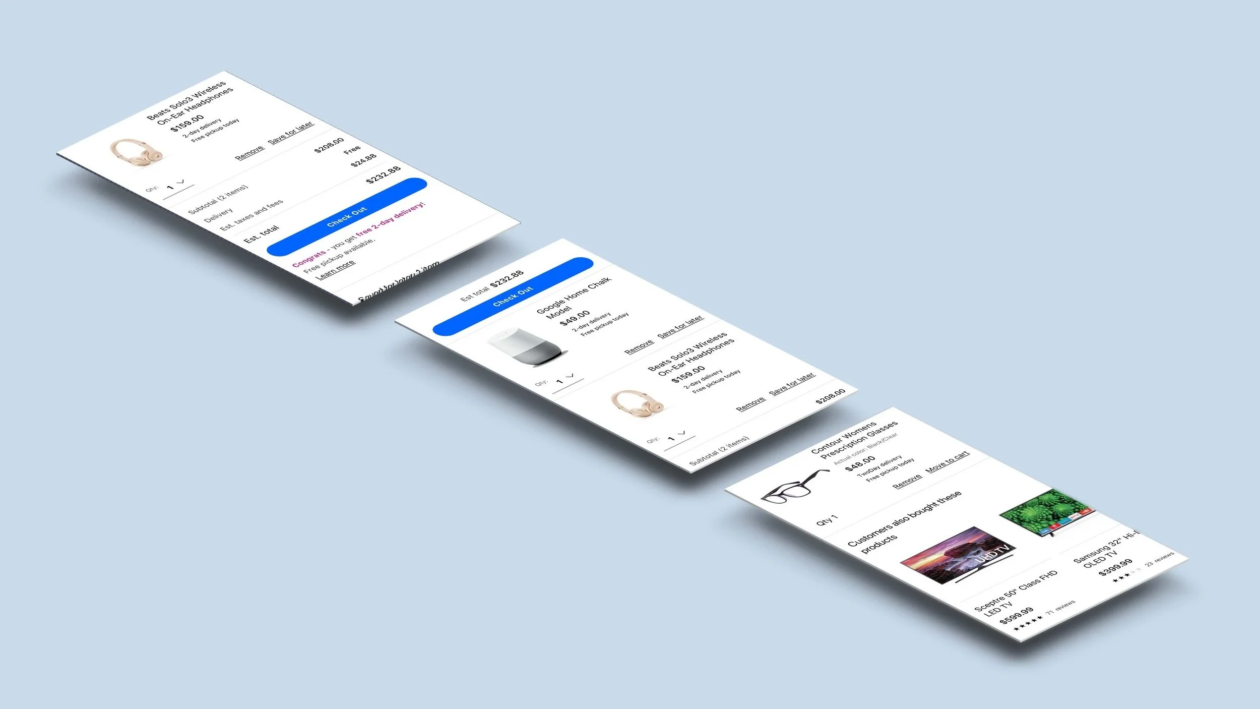
In June 2018, Walmart.com reimagined it’s digital experience with a new, customer-centered design system. As part of this effort, I was responsible for the redesign of the Cart experience on our iOS and Android apps.
My Role
I was responsible for the experience strategy and design of Cart for our iOS and Android apps. I worked with our Head of Design Systems to ensure the new visual language was implemented. I partnered closely with product owners, engineering and data analytics teams to ensure the project was completed in it’s 10-week timeline.
Design Goals
In order to improve not only the visual design of the cart but also the functionality, three key goals were identified:
Allow customers a clear path to check out
Ensure customers are aware of what is in their basket and how much it costs
Provide entry points for the customers to continue shopping
Results
With all the significant changes included in this release, we ramped slowly over the course of 4 weeks. I worked closely with product, analytics and engineering to A/B test the new experience and iterate, once we observed any breakage. These iterations included increasing the emphasis on the free shipping message and displaying the number of items in the Order Summary subtotal, so customers felt confident continuing to checkout. After ramping to 100%, we observed a net GMV gain of over 50bps (0.5%).

