
Year
2019
Team
Design lead (me)
UX designer
UX researcher
Product manager
Engineering team
Rethinking Walmart.com’s post transaction experience
Walmart is one of the largest e-commerce sites in the world, with over two thirds of it’s orders coming from repeat customers. An engaging post transaction experience is critical to retaining customers and ensuring a consistent user experience throughout the entire purchase journey. The new walmart.com Account/Purchase History needed to reflect these sensibilities, combining discoverable actions and a compelling commerce experience.

Background
The walmart.com Account page had not been redesigned in many years. Through comments captured through feedback entry points (Voice of Customer comments), as well as topics for Customer Care calls - we knew customers’ post transaction needs were not being met.
Our challenge was to redesign the Purchase History section of Walmart.com in order to reduce calls to customer care, increase item reorders and ultimately, drive customer retention.
Throughout this project, I worked collaboratively with research, content strategy, product, engineering and analytics partners. As we were approaching design hand-off, another UX designer joined our team in order to help with executing production design. All designs shown in this case study are my contributions.
The goal
Make the complex seem simple
When customers navigate to their Account to view their purchase history, the primary use case is order tracking. However, there are also a number of other key actions that need to be easily accessible, such as item reordering, returns and cancellations, invoice management etc. Clearly displaying all these actions, while keeping things simple was our goal.
In order to uncover their desired action, customers needed to have a level of familiarity and even expertise to sort through the noise and complete their task. Prior to the redesign, the Account pages looked like this:
Before the redesign: Walmart Purchase History and Order Details
Partnering with a UX researcher, we sought out to learn why customers were not satisfied with the post transaction experience on walmart.com. To do this, we wanted to gain a solid understanding of trends that set the standard for the eCommerce industry, as well as the needs and frustrations that our customers were experiencing.
Research
Research goals
To learn what customers’ biggest frustrations were.
To understand user needs and identify areas for improvement.
To learn what makes a post transaction experience satisfying.
To determine the standard for an engaging post transaction experience.
Voice of Customer data
Walmart is fortunate to receive over 2000 comments a day via the Feedback CTA located on each page. To get started, we worked with a data analyst to isolate Account-specific comments and identify trends that could help shape our design direction. Using these insights, we identified the following pain points:
Order tracking - “It does not track my packages or show my recent orders”
Order history - “I order a lot of items of this web site, when looking back on item order you can not tell what size you ordered when buy hundreds of items I need to be able to look back and see exactly what I ordered in detail.”
Order cancellations - “Why can’t I cancel items? How do I find out how to do this without calling? Amazon make it easy”
Returns & refunds - “I returned my row machine 3 weeks ago and don’t see anything on my card. How can I tell when this will go thru?”
UX research methodology
Our UX researcher conducted a moderated study in which customers went though a variety of typical post transaction tasks using their mobile phones, on Walmart and our two leading competitors; Amazon and Target. The tasks included canceling an order, tracking an order, returning an item and reordering a previously purchased item.
Findings & recommendations
At the end of the study, it was clear that customers were confused by the tracking information on Walmart. Customers struggled to clearly identify how to complete tasks and which actions were on which page. On competitors’ sites, customers appreciated the simplified CTAs and the mobile-first approach, particularly in the case of Amazon.
The main recommendations for the design team were:
Improve information hierarchy
Centralize actions at order, group and item level
Improve tracking information
Provide an easy path to reorder

Mapping goals
With these recommendations in mind, I reflected on the business & user goals and where they intersected. This provided a clear direction for the next phase of the design process.
Ideation
Centralize key actions
A key goal, both from within the design team and based on research recommendations, was to centralize key actions and organize them based on whether they were connected to the entire order, package or item. This would help with discoverability and create a clear hierarchy. In order to do this, I first made a list of all the actions and organized them into groups based on the relevant part of the order.

I then began the process of wireframing with lo-fi wires of the main use cases for the Purchase History and Order Details pages on mWeb. During this process, I thought about how to make the actions discoverable and maintain the hierachy laid out in the table above. I also tried to ensure the layout and content could be structured to satisfy user and business goals in a technically feasible way. After several iterations, I realized that the previous approach of purely responsible design was not serving our mobile customers and was overcomplicating the Purchase History page. I decided to simplify the Purchase History view and focus on order tracking, while making the actions easily discoverable on the Order Details page.

Early wireframes helped set the tone for the rest of the project
Test
Usability testing
At this stage in the process, I partnered with our UX researcher to validate whether the new direction was meeting customer needs. Overall, users navigated through various tasks with ease. The decision to go with a mobile first approach and design experiences that best met the need of each platform resonated with users and helped with CTA discoverability.
Recommendations after testing:
Customers expected to tap on the entire item cell to proceed to the next page rather than just the caret. Ensure that the implementation meets these expectations.
Consider adding more detailed order tracking information to the Purchase History page.
The tracking progress indicator could be confused for a section break on smaller screen sizes. Consider reserving that for desktop.
Customers wanted to know how many packages they were receiving per order. Consider adding this information.

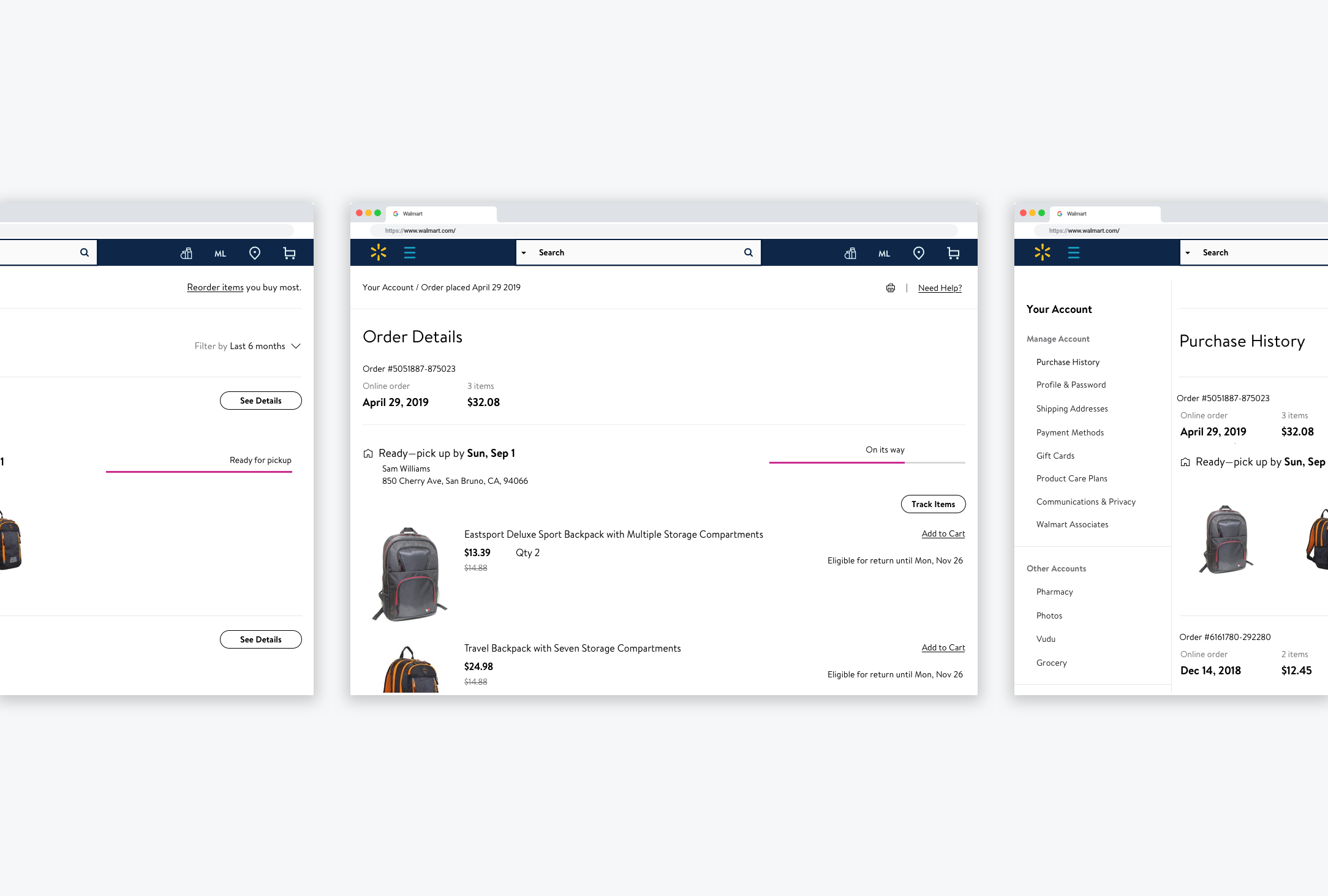
The new Walmart Account design
Next steps
The redesigned purchase history experience is currently in AB testing and is expected to launch fully by March 2020. Although it is too early to gauge it’s effect on Walmart’s NPS, business metrics are currently solid, with a 3.4% increase in item reordering and 4.9% reduction in order related calls to customer care vs control.